
With this widget, you can display images, text, products, or testimonials in an upward-moving carousel. It helps you show your content in a clean and 3D interactive way. You can easily customize each slide using Elementor. It is ideal for portfolios, product sliders, and testimonial galleries.
Required Setup
- Elementor FREE Plugin installed & activated.
- You need to have the WDesignKit plugin installed and activated.
- Make sure you’ve created an account and logged into it.
- Make sure you’ve downloaded the Carousel Upward widget.
How to Activate the Carousel Upward Widget?
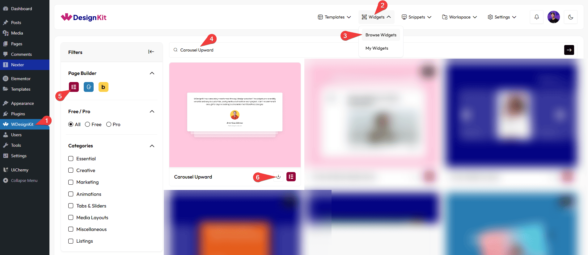
Go to
- WDesignKit → Widgets → Browse Widgets.
- Search the widget name and select Elementor as the Page Builder.
- Click on the Download icon.
Use Cases
Use an upward-moving carousel to show cards or slides that move smoothly upward.
Best For:
- Testimonials: Client reviews with photos and names.
- Product Cards: Highlight important or trending products.
- Portfolio: Show your work samples, case studies, and designs.
- Services: Display your main services with icons and descriptions.
- Blog / News: Show latest articles or announcements.
- Image or Mixed Content: Photo galleries or content slides.
- Promotions: Highlight offers, deals, or campaigns.
How to Use the Carousel Upward Widget in Elementor?
Add the Carousel Upward widget to the page.
Layout
You can select a pre-defined style from the Style dropdown.
Note : From this tab, based on the style you selected, you will see different options to add the content.
Content
From the Slides section, you can add the list items. By default, you’ll find five repeater items; open it.
In the Description field, you can add the description of the slide.
From the Select Image section, you can choose an image for the slide.
In the Author Name field, you can add the name of the author to the slide.
In the Author Role field, you can add the author’s role or designation to the slide.
Note: The Author Name and Author Role fields work only when you select Style 1 from the Style options under the Layout tab.
In the Subtitle field, you can add the subtitle to the slide.
Note: The subtitle field work only when you select Style 2 from the Style options under the Layout tab.
By enabling the Button toggle, you will be able to see its settings.
Then, in the URL section, you can add the button URL.
In the Button Text field, you can add button text to the slide
From the Background Color section, you can add a background color to the slide.
You can click on the + Add Item button to add more items.
Navigation
You can add an icon or SVG for the previous navigation button from the Prev Icon section.
You can add an icon or SVG for the next navigation button from the Next Icon section.
Extra Options
From the Active Slide section, you can enter a number to choose which slide should appear first.
By enabling the Autoplay toggle, the slides will move automatically.
From the Duration section, you can control how long each slide stays visible.
Note : Set duration in seconds for change slide.
Then, from the Style tab, you can further customize the style of the Carousel Upward.