
With this widget, you can create professional and visually appealing profile cards for your website. It provides an easy and user-friendly way to showcase team members, clients, or individuals. The profile cards are highly customizable, allowing you to personalize the design and seamlessly integrate them into your layout while enhancing overall presentation and user engagement.
Required Setup
- Elementor FREE Plugin installed & activated.
- You need to have the WDesignKit plugin installed and activated.
- Make sure you’ve created an account and logged into it.
- This is a pro widget. A valid WDesignKit Pro license is required to access and use them.
- Make sure you’ve downloaded the Profile Card widget.
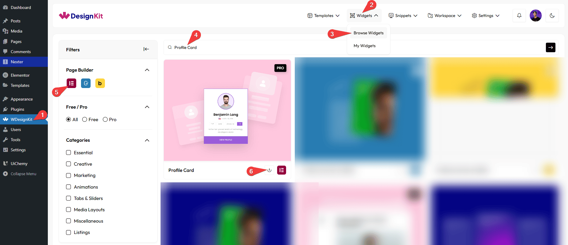
How to Activate the Profile Card Widget?
Go to
- WDesignKit → Widgets → Browse Widgets.
- Search the widget name and select Elementor as the Page Builder.
- Click on the Download icon.
Use Cases
Use this widget when you want to display people profiles in a clean, professional, and visually attractive card layout that is easy for users to scan and interact with.
Best For:
- Team Member Profiles: Showcase your team members with photos, names, roles, and social links in a structured and professional way.
- Company “About Us” Pages: Present founders, employees, or leadership teams to build trust and credibility.
- Freelancers & Personal Branding: Highlight individual profiles with skills, follower counts, and contact options for personal or portfolio websites.
- Clients & Partners: Display client profiles or partner details in a neat card-based layout.
- Influencers & Creators: Show social profiles with follower statistics and quick follow or message buttons.
- Community & Membership Websites: Present community members, mentors, or contributors in an organized grid.
- Educational Websites: Introduce instructors, trainers, or mentors with short bios and profile links.
- Marketing & Agency Websites: Feature team expertise, creative professionals, or consultants to enhance brand value.
- User Engagement Enhancement: Encourage interaction through follow, message, and view profile buttons directly from the card.
- Design-Focused Websites: Ideal for modern websites that want a polished, customizable, and visually appealing profile presentation instead of plain text lists.
How to Use the Profile Card Widget in Elementor?
Add the Profile Card widget to the page.
Layout
You can select a pre-defined style from the Style dropdown.
Note : From this tab, based on the style you selected, you will see different options to add the content.
Content
From the Members section, you can add the card items. By default, you’ll find one repeater item; open it.
In this Name section, you can add the name to be displayed on the profile card.
In this Email section, you can add the email address for the profile.
In this Description section, you can add a short bio or description for the profile card.
In the Number of Posts section, you can add skills or categories. Use commas to add multiple tags (for example: PHP, Java).
In the Number of Followers section, you can show the follower count.
In the Number of Following section, you can show the number of accounts being followed.
In this Facebook URL section, you can add the link to the Facebook profile.
In this Instagram URL section, you can add the link to the Instagram profile.
In this Twitter URL section, you can add the link to the Twitter profile.
In this Google Plus URL section, you can add the link to the Google Plus profile.
In this LinkedIn URL section, you can add the link to the Gmail contact or email link.
In this Follow Button URL section, you can add the link for the follow button.
In this Message Button URL section, you can add the link for the message button.
In this View Profile URL section, you can add the link for viewing the full profile.
Then, you can manage the title color and email color.
You can manage the background color of the top background content.
You can manage the background color of the bottom background content.
Profile Summary Style
You can select a Profile Summary style from the Style dropdown. These styles are applied to the Profile Card and control how Posts, Followers, and Following are displayed. You can switch between different styles as needed.
Style 1: Displays Posts, Followers, and Following in a horizontal layout.
Style 2: Displays Posts, Followers, and Following in a vertical layout.
Posts
From the Select Icon section, you can choose either an icon or an SVG of the post.
In the Posts Text section, you can add the text of the post.
Followers
From the Select Icon section, you can choose either an icon or an SVG of the followers.
In the Posts Text section, you can add the text of the followers.
Following
From the Select Icon section, you can choose either an icon or an SVG of the following text.
In the Posts Text section, you can add the text of the following text.
Special Options
In the Follow Button Text section, you can add the text to the follow button.
In the Message Button Text section, you can add the text to the message button.
In the Profile Button Text section, you can add the text to the profile button.
Button Text
You can set the number of columns of testimonial thumbnail items for desktop, tablet, and mobile separately from the Desktop Column, Tablet Column, and Mobile Column sections, respectively.
Note: You can use these options to control how many cards are displayed on different devices.
Extra Options
By enabling the Hide Description toggle, you can hide the description section.
By enabling the Hide Profile Summary toggle, you can hide the profile summary.
By enabling the Bottom Social Icon toggle, social icons will be displayed at the bottom.
By enabling the Bottom Button toggle, the button will be displayed at the bottom.
Then, from the Style tab, you can further customize the style of the Profile Card.