With this element, you can add a navigation bar that stays fixed on the side of your website as users scroll. It allows visitors to easily access important links without needing to scroll back to the top, making it more convenient for users to find what they need by keeping the menu always visible.
Required Setup
- Bricks Builder installed & activated.
- You need to have the WDesignKit plugin installed and activated.
- Make sure you’ve created an account and logged into it.
- This is a pro element, so make sure you have the WDesignKit Pro license activated in your WDesignKit account.
- Make sure you’ve downloaded the Side Sticky Header Menu element.
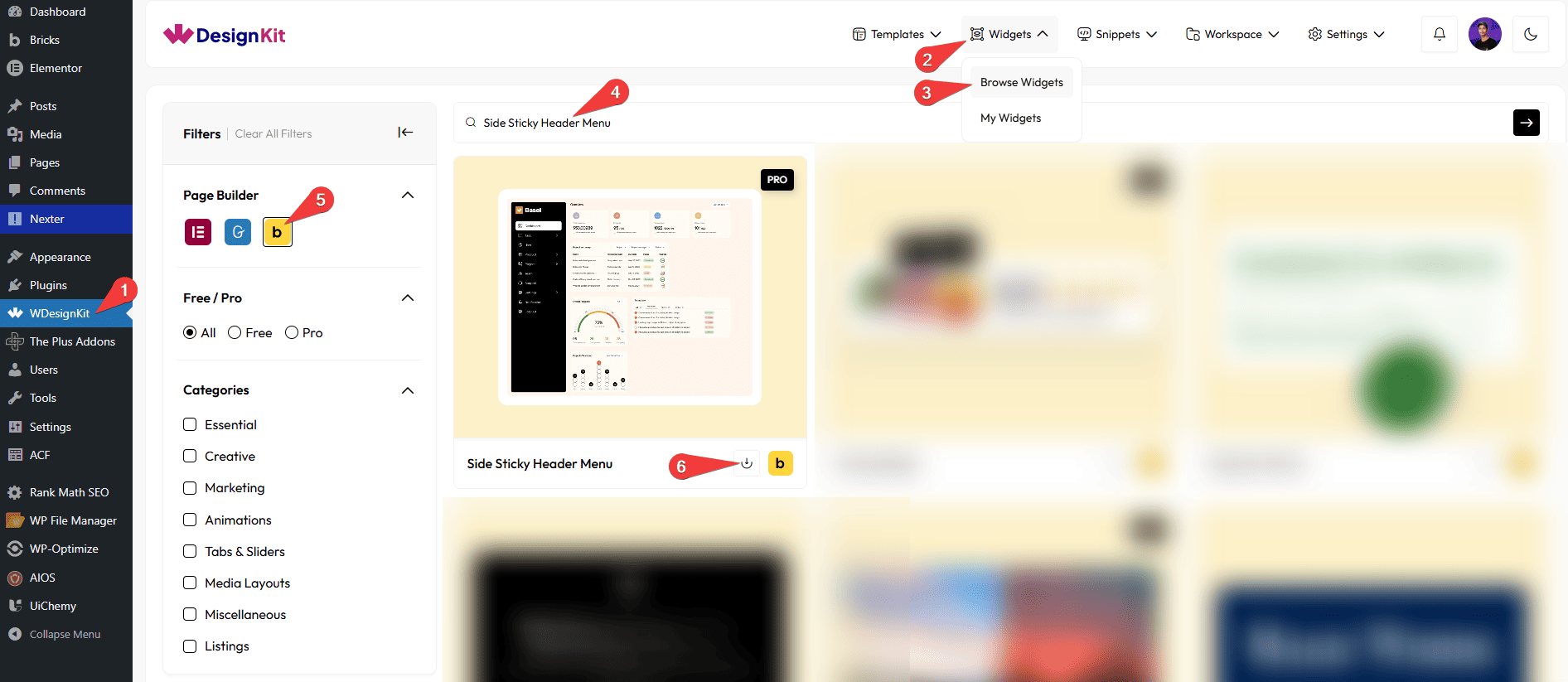
How to Activate the Side Sticky Header Menu Element?
Go to
- WDesignKit → Widgets → Browse Widgets.
- Search the element name and select Bricks as the Page Builder.
- Click on the Download icon.
Use Cases
Use the Rating Badge element when you want to display user ratings and reviews in an interactive and visually engaging way. It allows you to showcase feedback using profile icons and rating badges, making it easier for users to trust and understand your content. With hover tooltips providing additional details like user information and review insights, this element enhances user experience and credibility across your website.
Best For:
- User Reviews Display: Show customer feedback using profile icons and rating badges.
- Testimonials Sections: Present user opinions and experiences in an interactive format.
- Product Ratings: Highlight product ratings to help users make informed decisions.
- Service Feedback: Display client reviews and satisfaction levels for your services.
- E-commerce Websites: Build trust by showcasing real user ratings and comments.
- Portfolio Websites: Add credibility by displaying client feedback and ratings.
- App & Software Reviews: Share user ratings and insights for apps or digital products.
- Marketing & Promotions: Use ratings to influence user decisions and improve conversions.
- Community Platforms: Highlight user contributions and feedback visually.
- Modern UI Design: Perfect for clean, interactive, and user-friendly review layouts.
How to Use the Side Sticky Header Menu Element in Bricks?
Add the Side Sticky Header Menu element to the page.
SITE LOGO
In the Select Image section, you have to choose the logo image for the navigation menu.
Note : If no image is selected, a placeholder image will be shown by default.
CONTENT
In the Menu Icon Type dropdown, you can select either an icon or an SVG for the navigation menu.
Note: If you select Icon from the dropdown, you should choose an icon from the repeater Icons section, to get relevant styling options. The same rule applies to the SVG type.
Then, you’ll see a repeater item, open it.
In the Menu Position dropdown, you have to choose the menu position. Here, you’ll find two options.
- Level 1: To add a parent menu item.
- Level 2: To add a submenu or child item for the parent menu.
Note: You should select Level 1 for the first repeater item.
You can add an icon or SVG to the Navigation Menu from the Select Icon section.
In the Text section, you can add the text for the menu item.
Then, in the URL section, you can add the URL for the menu item.
By enabling the Open in new tab toggle, the attached URL will open in a new browser tab.
Note: When a menu has dropdown (level-2) items, the URL will not work.
You can add an icon or SVG to the dropdown for the menu item from the Dropdown Icon section.
Then, you can click on the + ADD ITEM button to add more menu items.
EXTRA OPTIONS
From the Position dropdown, you can set the menu position. Here, you’ll find two options.
- Fixed: To set the menu position to fixed, so the menu remains fixed even when the user scrolls.
- Relative: To set the menu position to relative, so the menu will scroll as the user scrolls.
Then, from the Style tab, you can further customize the style of the Side Sticky Header Menu.