
With this widget, you can display the tags used in your posts in a simple and eye-catching cloud style. You can even add your own custom tags to highlight specific topics, making it easy for users to identify popular topics at a glance. This interactive layout helps visitors quickly explore and navigate to content based on the tags used across your site.
Required Setup
- Elementor FREE Plugin installed & activated.
- You need to have the WDesignKit plugin installed and activated.
- Make sure you’ve created an account and logged into it.
- Make sure you’ve downloaded the Tag Cloud widget.
How to Activate the Tag Cloud Widget?
Go to
- WDesignKit → Widgets.
- Search the widget name and select Elementor as the Page Builder.
- Click on the Download icon.

How to Use the Tag Cloud Widget in Elementor?
Add the Tag Cloud widget to the page.
Layout
From the Select Style dropdown, you can choose three different styles to display your post.
Content
From the Content Type dropdown, you have to select the content type. Based on the selected option, the corresponding content will be displayed. Here you’ll find two options –
- Post – Displays the post content that you have previously created.
- Repeater – Allows you to create and display custom content after selecting this option.
Based on your selection, you’ll find different options to add the content.
Let’s start with the Post section,
From the Taxonomy dropdown, you have to select the taxonomy.
Note: The Taxonomy option will work only when Post is selected as the content type.
From the Post Type dropdown, you have to select the post type.
In the Max Post field, you can set the maximum number of posts that will be displayed in the box.
Now, move on to the Repeater section.
By default, you’ll see one repeater item under the Items section. Open it.
From the Icon dropdown, you can select the icon type for the post tag. Here you’ll find three options –
- None – To only have a post tag.
- Icon – You can add an icon or SVG to the tag from the Icons Control section.
- Image – You can choose an image for the tag from the Media section.
Based on your selection, you’ll find different options to add the tag.
In the Text section, you can add the text as a tag.
Then, in the URL field, you can add the tag URL.
Then, you can manage the Desktop/Tablet/Mobile/ Font Size, Text Color, Icon Color, SVG Color, Background Color, and Border Type Options for Style 1 & Style 2.
For Style 3, you can set the font size for your tags separately for desktop, tablet, and mobile devices using the Desktop Font Size, Tablet Font Size, and Mobile Font Size sections, respectively.
Then, you can click the + Add Item button to add more tags.
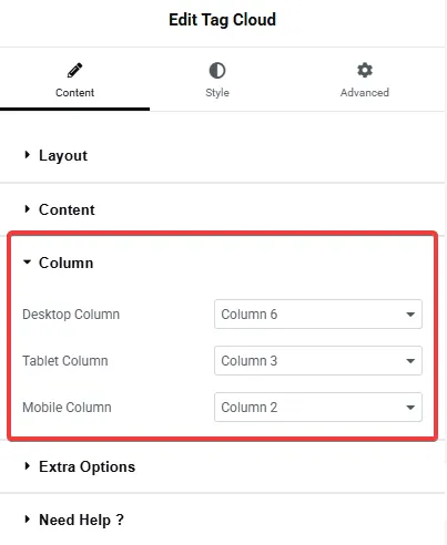
Column
You can set the number of columns for your post type items separately for desktop, tablet, and mobile devices using the Desktop Column, Tablet Column, and Mobile Column sections, respectively.
Extra Options
From the Gap section, you can adjust the gap between the columns for responsive devices.

Then, from the Style tab, you can further customize the style of the Tag Cloud.