With this element, you can easily show before-and-after images on your website. Users can move a slider to compare the two images smoothly. The Before After Slider element is easy to customize and helps you display image comparisons in a clean and engaging way.
Required Setup
- Bricks Builder installed & activated.
- You need to have the WDesignKit plugin installed and activated.
- Make sure you’ve created an account and logged into it.
- Make sure you’ve downloaded the Before After Slider element.
How to Activate the Before After Slider Element?
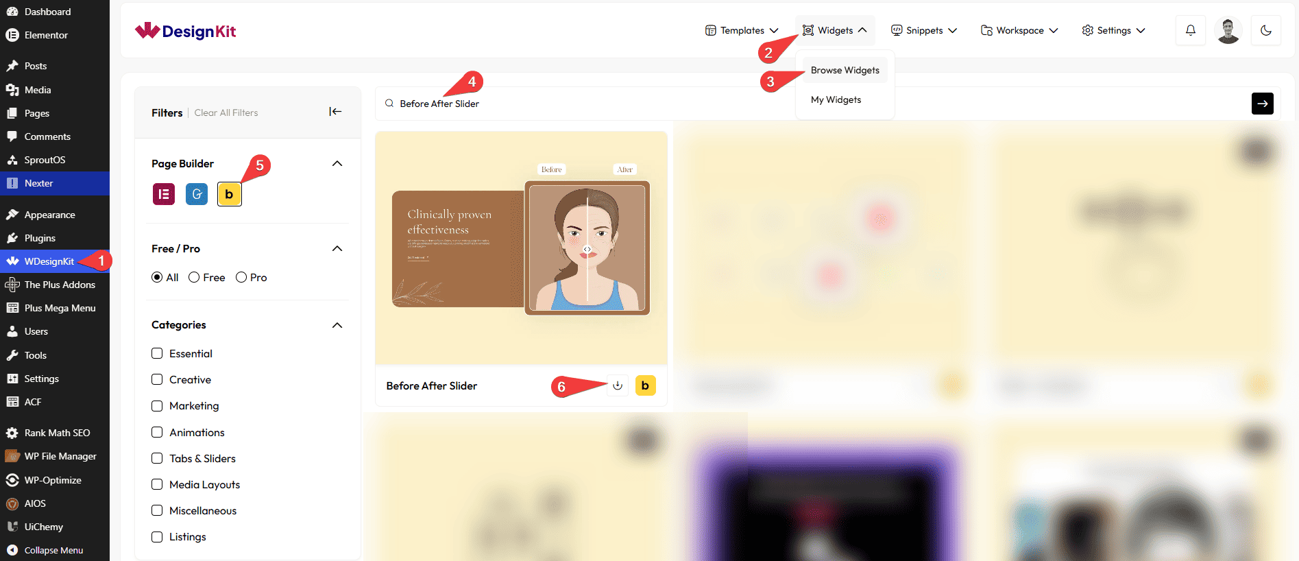
Go to
- WDesignKit → Widgets → Browse Widgets.
- Search the element name and select Bricks as the Page Builder.
- Click on the Download icon.
Use Cases
Use the Before After Slider element when you want to clearly show the difference between two images in an interactive and easy-to-understand way.
Best For:
- Product Comparisons: Show how a product looks before and after an update, improvement, or feature change.
- Image Editing & Design Work: Perfect for displaying photo edits, retouching, color corrections, or design transformations.
- Website Redesigns: Compare old and new website designs to highlight improvements.
- Makeovers & Transformations: Ideal for beauty, fitness, home renovation, or interior design results.
- Service Results: Show the impact of your services, such as cleaning, restoration, or repair work.
- Marketing & Case Studies: Visually explain results and success stories with clear before-and-after comparisons.
- Landing Pages: Grab user attention by showing changes or improvements instantly.
- User Engagement: The slider interaction encourages users to move the handle and explore the comparison.
- Clean & Professional Websites: Best for websites that want a simple, modern, and clear way to present visual changes.
How to Use the Before After Slider in Bricks?
Add the Before After Slider element to the page.
LAYOUT
You can select a pre-defined style from the Style dropdown.
Note : From this tab, based on the style you selected, you will see different options to add the content.
BEFORE SECTION
In the Before Text section, you can add text to the before image.
In the Select Image section, you can add a label for the before image.
In the Image Size section, you can choose the size of the image to be displayed for the before state.
Note : If no image is selected, a placeholder image will be shown by default.
AFTER SECTION
In the After Text section, you can add text to the after image.
In the Select Image section, you can add a label for the after image.
In the Image Size section, you can choose the size of the image to be displayed for the after state.
Note : If no image is selected, a placeholder image will be shown by default.
SLIDER ICON
From the Select Icon of Before Icon section, you can choose either an icon or an SVG for the before image.
From the Select Icon of After Icon section, you can choose either an icon or an SVG for the after image.
Then, from the Style tab, you can further customize the style of the Before After Slider.