Are you looking to enhance your Elementor experience and create custom widgets tailored to your specific needs? Sometimes, the ready-made widgets just don’t cut it, and you need something more tailored to your specific needs. That’s where custom widgets come in! By creating custom widgets, you can easily add new features and functionalities to your website.
With the Free WDesignKit Widget Builder, you can take your Elementor website customization to the next level. By creating custom Elementor widgets, you have the power to design unique elements that perfectly match your vision and make your website stand out from the crowd.
Note: We are showing the Elementor widget here but the process remains the same for Gutenberg and Bricks as well.
Required Setup
- Elementor FREE Plugin installed & activated.
- You need to have the WDesignKit plugin installed and activated.
How to Use the WDesignKit Widget Builder?
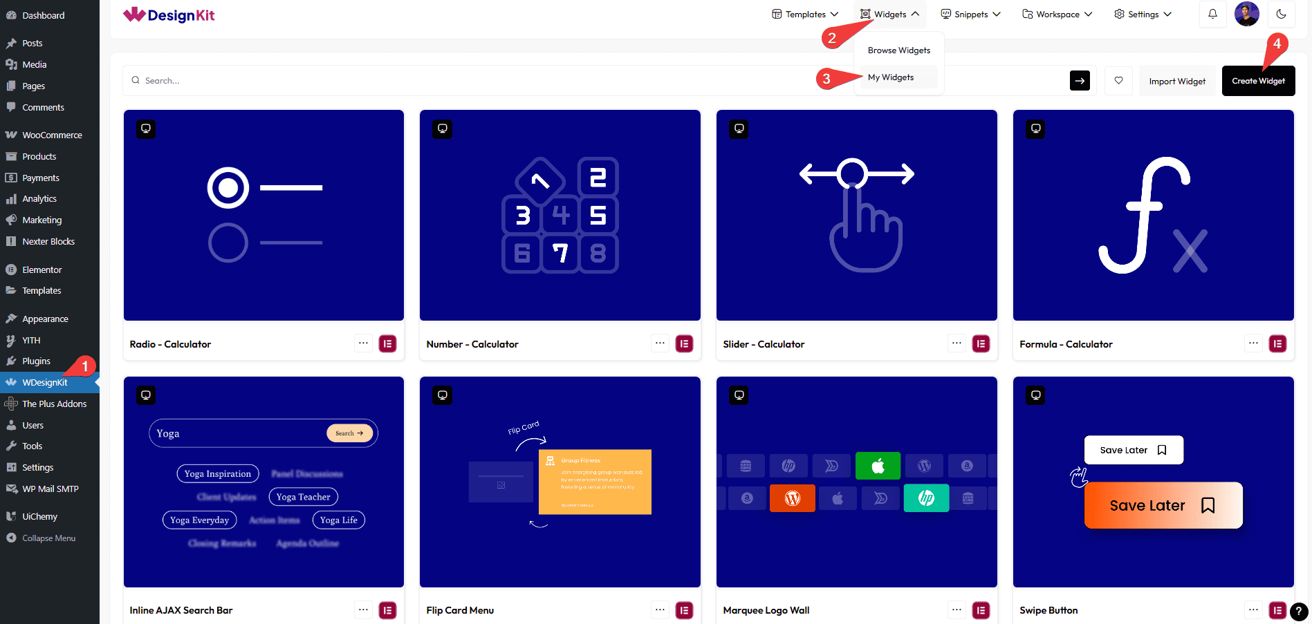
To use the WDesignKit widget builder from the Dashboard, go to WDesignKit. On the next page, click on the Widgets > My Widgets.
Here you’ll find all of your custom widgets. If you haven’t created any widgets yet, click the Create Widget button.

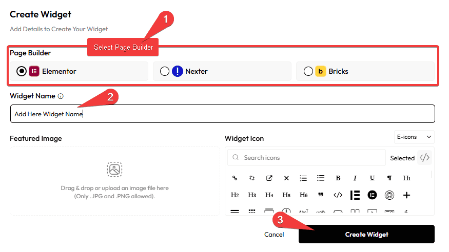
Now a popup will open, here you’ll have to fill in your widget details –

Page Builder – You can create a widget for Elementor, Gutenberg, and Bricks. From here, you have to choose your preferred page builder. Select Elementor, as we are covering Elementor widgets here.
Widget Name – Here you’ll have to add your widget name.
Featured Image – This is an optional field, here you can add a featured image of your widget, which will be visible on the WDesignKit Widget Listing section.
Widget Icon – Here you can add an icon for your widget. You’ll see different icon library options for different page builders. For Elementor, you can add icons from E-icons, Font-Awesome libraries. You have to add the icon name in the field.
Note: It is recommended to use icons from the E-icons library. If you use font awesome 4 or 5 icons you have to manually load the respective libraries.
Once done, click on the Create Widget button.
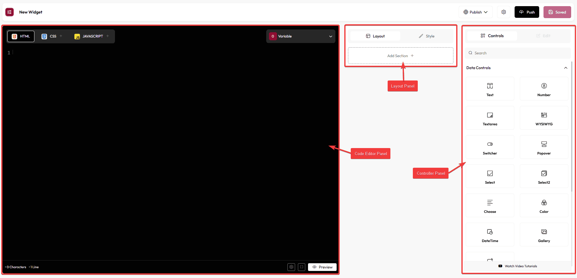
On the next page, you’ll see the widget builder editor. Here, you’ll mainly see three columns: the Code Editor Panel, the Layout Panel, and the Controller Panel.

Code Editor Panel
In the code editor panel, you’ll find three tabs –
HTML – Here, you’ll have to add the HTML code of your widget. You’ll also get the option to add different controls here.
CSS – Here, you’ll have to add the CSS of your widget to style it. You can even make the CSS specific to the widget only. Learn more.
JS – Here, you’ll have to add the JS of your widget for any custom interactivity. From here, you can also make the JS widget specific. Learn more.
Layout Panel
In the middle, you’ll find the layout section where you can add different controls from the Controller panel. The structure you create here will reflect on the Elementor editor widget panel.
Here you’ll find two tabs: Layout and Style.
In both tabs, you can add any controls, but for better organization, you should add layout related controls in the Layout tab and style related controls in the Style tab.
Whenever you drag and drop any control, it will create a new section, or you can click on the + Add Section button to create a new section.
You can rename the section, drag and drop to rearrange the sections.
Controller Panel
Then, in the controller section, you’ll find different controls. You can drag and drop these controls in the layout section to create different options to make your widget dynamic. Here you’ll find many powerful controls –
Data Controls
In this tab, you’ll find controls that return single value –
Text – This will add an Elementor text input field, where users can add content. You’ll find different options for the text field –
- Name – Here, you can add a unique name to the control.
Note: By default, the controls have a unique name, but if you edit it, make sure it is unique and not used on other controls. Otherwise, it would conflict with other controls.
- Default Value – From here, you can add a default value of the input field.
- Label – For editing the field label.
- Show Label – From here, you can show or hide the field label.
- Label Block – From here, you can make the label inline or block.
- Description – For adding a description of the control.
- Placeholder – For adding a placeholder to the input field.
- Separator – From here, you can add a separator line to the control.
- Sanitize – From the Sanitize dropdown, you can choose how to sanitize or escape the data before it is rendered. This ensures that the input or query is treated securely as plain text, preventing unwanted code execution.For example, if you add a JavaScript query, it will be displayed as normal text instead of running as a script. Similarly, if you use the URL sanitizer, it will treat URLs as text for security purposes.
- Conditions – With this option, you can add display conditions to your control. Learn more.
- AI Support – By enabling this toggle, you can get AI assistance for your control. You can use this option to automatically generate or suggest text for the selected field.
- Dynamic – With this option, you can enable the Elementor dynamic tags option within your control.
- Input Type – From here, you can use different input types such as text, number, color, date, and more.
- Classes – This can be used to add a custom style to the control. Learn more.
Note: Most of these options are common in all the controls. So now we will only cover unique options related to a specific control.
Number – This will add a number input field.
- Number Setting – From here, you can set max and min values of the number input field, so the numbers will remain within that range. You can also set steps for changing the value.
Textarea – This will add a textarea.
- Rows – From here, you can set the number of rows of the textarea.
WYSIWYG – This will add a Elementor WYSIWYG editor.
Code – This will add a code editor. With this, you can allow users to add code through your widget.
- Rows – From here, you can set the number of rows of the code editor.
- Code – From here, you can select the language of the code editor; you can choose from HTML, CSS, and JavaScript.
Note: When using CSS or JS make sure to add the control unique name inside <style></style> or <script></script> tag, respectively.
Switcher – This will add a switcher control. This can be best used to show or hide other fields using conditions. Learn the process.
- Switcher Label – Here, you can set the on and off label of the switcher
- Return Value – Here, you can set the value of the switcher field, this value can be used for creating conditions.
Popover – This will add a popover toggle control. In this control, you can add other controls and it will show all those controls in a toggle popup.
Select – This will add a select field.
- Drop Down Value – Here, you can add the values and labels of the select dropdown field.
Select2 – This will add a select2 control. With this, you can allow users to select multiple values. Learn the process.
Choose – This will add a choose control. This can be used to align content. Learn the process.
Color – This will add a color picker field. This is a style related control and can be used to colour elements using Selectors and Selector values. Learn the process.
- Alpha – From here, you can enable the transparent option within the color picker.
- Global Color – From here, you can enable Elementor’s global color option within the color picker.
DateTime – This will add a date time picker. With this user can add a date and time.
Gallery – This will add a gallery control. With this, you can add multiple images as a gallery. Learn the process.
Repeater – This will add an Elementor repeater control. You can add a set of different controls inside a repeater control that can be repeated. Learn more.
Dynamic Controls
In this tab, you’ll find dynamic controls –
Post Listing – From this option, you can choose how to display your posts. You can select the Post Type, set the number of posts to display, and include or exclude specific posts (such as Posts, Pages, Floating Elements, Products, or Custom Post Types) using their IDs. You can also arrange the posts by date or order and define how many categories and tags to show.
Select Template – This will add a template select dropdown, which can be used to select and use Elementor templates.
Product Listing – From this option, you can choose how to show your products. You can select the Product Type, set how many products to display, include or exclude specific products (such as Products) using their IDs, and arrange them by date or order. You can also set how many categories and tags you want to show.
Taxonomy – From this option, you can select the taxonomy type, post type, and set the maximum number of posts to display.
MultiValue Controls
In this tab, you’ll find controls which returns multiple values –
URL – This will add an URL control, which can be used to add a URL field.
- Is External – From here, you can set the Open in new window option unchecked or pre-checked by default.
- No Follow – From here, you can set the Add nofollow option unchecked or pre-checked by default.
- Attributes – From here, you can pre-fill some custom attributes for the URL by default.
Note: Make sure to add the URL control inside an anchor tag like this ‘<a href=”{{url_5yqiye23-url}}”>Your text</a>’.
Media – This will add a media control, which allows users to add media from the WordPress media library.
- Media Types – From here, you can select allowed media types. Here, you’ll find three options: Image, Video, and SVG. Learn more.
IconsControl – This will add an icons control, which allows you to add icons from the Elementor icon library or you can add custom SVG icons as well.
- Types – From here you can select the layout type between Media and Inline. In the Inline option, you can exclude icon or custom svg option.
- Parent Class – Enabling this will wrap the image tag (img or svg) in a span tag with a class name “tp-title-icon“.
Unit Controls
In this tab, you’ll find controls which returns unite based values –
Slider – This will add a slider control, which will add a draggable range slider. This can be best used to set some style related units like width, size etc.
- Show_unit – From here, you can include or exclude units from the value. This can be useful for CSS properties such as z-index, font-weight etc. where units are not required.
- Size_unit & Range – From here, you can enable different unit types for the slider, you can also set different max and min values for each unit, along with steps for changing the value.
Note: The Selectors value and Selectors fields work similarly as in the Choose control.
Dimension – This will add a dimensions control, which will add an input field to add value for top, right, bottom, left and the option to link them together. This can be used to style elements which can have four values, such as padding, margin, border, etc.
- Select Default Unit – From here, you can select the default unit.
- Size_unit – From here, you can set different units.
NormalHover – This will add a control tab, which can be used to style different states such as normal, hover, active etc. of an element. Learn more.
UI Controls
In this tab, you’ll find controls that only effects the UI of the Elementor widget panel and don’t return any value –
Heading – This will add a heading control, which can be used to add a text heading between other controls in the UI panel.
RawHTML – This will add a raw HTML control, which can be used to add some descriptive information in the UI panel.
Divider – This will add a divider control, which can be used to add a divider between other controls in the UI panel.
Preview – From this option, you can view a live preview of your widget or design before publishing, allowing you to see how it will appear on the front end.
Note: You don’t need to manually add these UI Controls in the HTML editor, it will automatically show in the UI panel in the order you have set it in the Layout panel.
Group Controls
In this tab, you’ll find some group controls that groups several controls together –
Typography – This will add a typography group control, which contains all the options to manage the typography of a text element.
TextShadow- This will add a text shadow group control, which groups together all the options to manage the text shadow.
BoxShadow- Similar to text shadow, this will add a box shadow group control.
Border – This will add a border group control to manage the border.
Background – This will add a background group control, which can be used to manage the background of an element.
CSS Filter – This will add a CSS filter group control to manage the CSS filter.
How to Add a Control in the Editor?
Now, to add a control in the editor, drag and drop any control from the Controller panel to the Layout panel. As soon as you add the control in the Layout panel, its relevant unique name will be added right sidebar of the HTML tab in the Code Editor panel.
Note: Some controls can have multiple options in a dropdown.
Then you have to add your relevant HTML code in the HTML tab, and then place the cursor where you want to add the control and click on the unique name in the right sidebar. The unique name will be added to the HTML.
Note: Make sure to only add relevant controls in the Editor that you want to show the value in the frontend.
Following this process, you can add multiple controls to your widget.
Once you have created your widget, click on the Save button at the top to save your widget.
Note: From the Publish dropdown you can also save your widget as a draft.
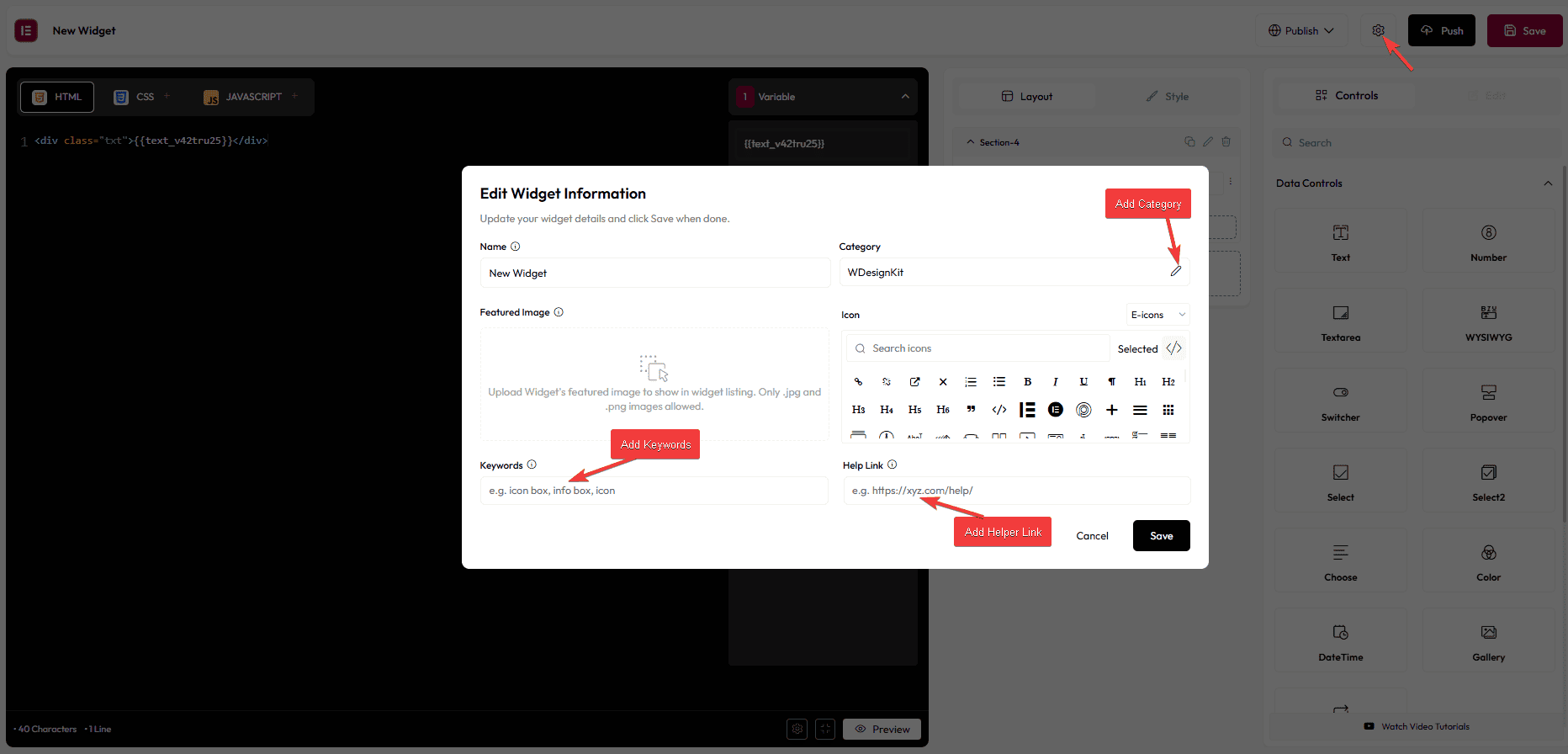
By clicking on the Settings icon at the top, you can edit your widget information. From the pop-up, you can also change the widget category.
In the Keywords field, you can add different keywords for your widget, which users can use to search the widget in the Elementor widget panel.
Then, in the Help Link field, you can add a helper link for your widget, where users can get more information about the widget.

From the Push button, you can upload your widget to the public library so other WDesignKit users can access your widget. Learn the process.
You can only push the widget created by you. Can’t push other’s widget. However, if you want to do this, first duplicate the widget and make the changes, and then push.
How to Create a Custom Elementor Widget?
For creating an Elementor widget, ideally, you should have the HTML, CS,S and JS of the layout read,y or if you are comfortable with coding, you can directly code in the Code Editor panel of the Widget Builder.
For example, we will convert this Codepen profile card layout into an Elementor widget.

To do this from the WDesignKit page, go to WDesignKit and click on the Add Widget button.
In the popup add an appropriate name and icon for the widget, then select Elementor as the page builder and click on the Add Widget button.
Now, copy and paste the HTML code from the Codepen item to the HTML tab of the Code Editor panel.
Note: Make sure to include required HTML code only, excluding <!DOCTYPE>, <html>, <head>, <title>, <body> etc.
Then go to the CSS tab, and copy and paste the CSS code from the Codepen item.
Note: Make sure not to include any global CSS such as body, * etc.
In a similar way, if you have any JS, you have to add it in the JS tab.
Once you have all the code in place, you should be able to see the layout preview in the Live Preview panel.
Go back to the HTML tab of the Code Editor panel, and now, based on your layout, you have to choose the relevant controls.
For our layout, we need to use the Media control for the profile image.
To do this, search the media control and drag and drop it on the Layout panel, then delete the image source code from the HTML code and add the Media control by clicking on its unique name in the right sidebar.
Note: You can change the control labels to appropriate names.
Following the same process, we will add a Text control for the card title and add it to the HTML code.
We will add another Text control for the subtitle.
For the button text, we can use another Text control.
Then, for the button URL, we will add the URL control. To add the URL control, select and delete the button URL from the HTML, and then click on the URL control’s unique name in the right sidebar. It will open a dropdown, then click on URL from there.
Note: You can use different style controls to manage the background, typography etc. by using Selectors and Selector values. Learn the process.
Once done, click on the Save button, and now your widget is ready to use.
To use the widget, open a page or post with Elementor and then search for your widget. Drag and drop it on the page, then you’ll see all the relevant options in the widget.
Note: To use a Bricks widget you need to have the Bricks theme installed and activated.
