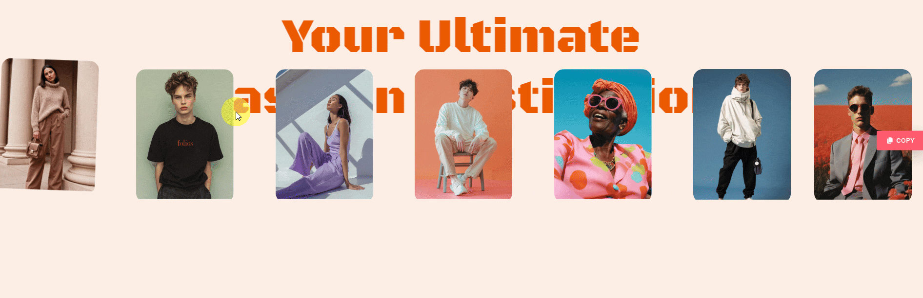
With this widget, you can add interactivity and a fun element while allowing users to move and position information boxes effortlessly. With smooth scroll-based animations and fully customizable content, this widget adds a dynamic touch while boosting user engagement.
Required Setup
- Elementor FREE Plugin installed & activated.
- You need to have the WDesignKit plugin installed and activated.
- Make sure you’ve created an account and logged into it.
- This is a pro widget. A valid WDesignKit Pro license is required to access and use them.
- Make sure you’ve downloaded the Draggable Info Boxes widget.
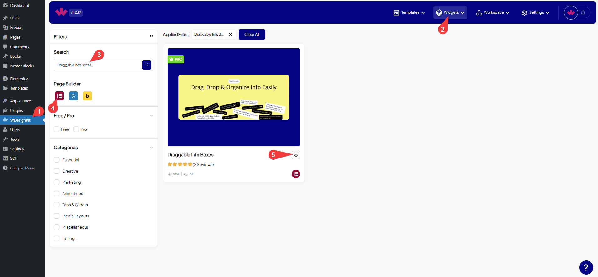
How to Activate the Draggable Info Boxes Widget?
Go to
- WDesignKit → Widgets.
- Search the widget name and select Elementor as the Page Builder.
- Click on the Download icon.
How to Use the Draggable Info Boxes Widget in Elementor?
Add the Draggable Info Boxes widget to the page.
Boxes
Once you add the widget, you’ll see a repeater item, open it.
From the Type dropdown, you have to select the Box type. Here you’ll find two options –
- Content – To add a text content.
- Image – To add an image.
Depending on the selected box type, you’ll have to then add the actual content.
Let’s start with Content here,
From the Icon Type dropdown, you have to select the Box type. Here you’ll find two options –
- None – With this option, you’ll not be able to add an icon or image.
- Icon – To add an icon.
- Image – To add an image.
In the Select Icon section, you can add an icon or SVG icon to the box content.
Depending on the selected Icon type, you’ll have to then add the actual icon.
From the Heading Tags dropdown, you can define heading levels (H1, H2, H3, etc.) for the box content.
In the Title section, you can set a title for the box content.
You can add descriptive text to the box content in the Description section.
From the Padding section, you can adjust the padding inside the box content.
Use the Left Offset section to set the left position of the box content.
Use the Top Offset section to set the top position of the box content.
Then, you can set the style of the Box’s Icon Color, Title Color, Description Color, Background, Border Color, and Border Radius.
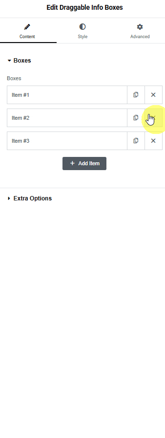
Then you can click on the + Add Item button to add more box items.
Extra Option
In the Friction field, you can adjust the value to see how quickly or slowly an object stops when sliding on a surface. A value of 0 means the object will slide for a long time, while a value of 1 means it will stop almost immediately.
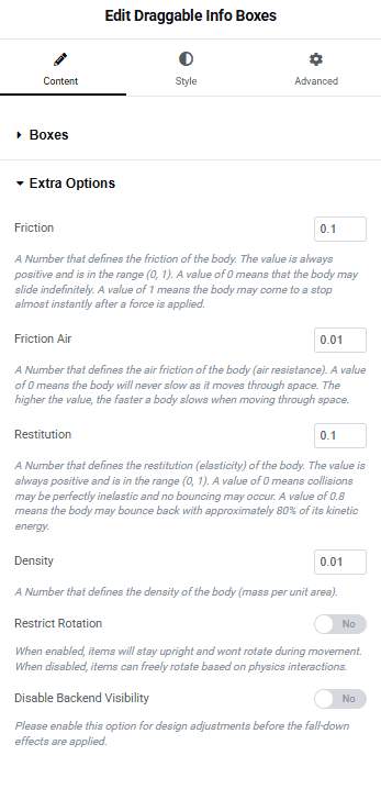
In the Friction Air field, you can adjust the value to see how quickly or slowly an object slows down while moving through the air. A value of 0 means the object won’t slow down at all, while higher values make it slow down faster.
In the Restitution field, you can adjust the value to see how quickly or slowly the item bounces after being dropped.
In the Density field, you can adjust the value to see how heavy an object feels compared to its size. If two objects are the same size, the one with higher density will feel heavier.
For example, if a rock and a sponge are the same size, the rock will feel heavier because it has a higher density.
By enabling the Restrict Rotation toggle, items will stay upright and won’t rotate during movement. When disabled, items can freely rotate.
By enabling the Disable Backend Visibility toggle, you can easily manage the design of layouts or items because the items will not collapse or move until you disable the toggle.
Then, from the Style tab, you can further customize the Boxes style.