Enhance the appearance of your custom Elementor widget controls with the Control Classes feature. This allows you to apply custom styles to your controls, making them visually appealing in the Elementor editor widget panel. Customize the look of your widget by adding personalized styles that suit your design preferences.
To check the complete feature overview documentation of The WDesignKit Widget Builder, click here.
Requirement – This feature is a part of The WDesignKit, make sure it’s installed & activated to enjoy all its powers.
Note: This feature is for advanced users only as it requires editing theme files.
Use Custom Class in a Control
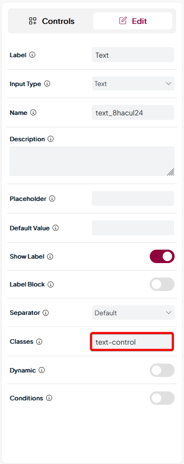
When you add any control in the Layout or Style tab, you’ll see a field called Classes, here you can add a custom class for the control, which you can target with CSS.

Note: Make sure to add the class name without any .(dot).
Add an Elementor Hook
Now, to use this class you have to call an Elementor hook, for that you can use this code.
add_action( 'elementor/editor/after_enqueue_styles', function() {

    wp_enqueue_style(
        'script-unique-name',
        get_stylesheet_directory_uri() . '/file_name.css',
        [], // Dependencies (like jQuery, or other scripts it depends on)
        time(), // Version for cache-busting (use `time()` or `filemtime()` for dynamic updates)
        false // Load in the header (set to `true` if you want it in the footer)
    );

} );
You can add this code to your child theme functions.php file, or you can Code Snippets plugin or you can add it through Nexter Builder if you are using the Nexter theme.
Then you can add your custom CSS in the child theme style.css file.
Now, that specific control within your custom widget will show a unique style as per your custom CSS in the Elementor widget panel.
Also, check How to Use the Choose Control to Set Predefined Styling Options.