With this element, you can create a 3d info card where the image will pop out of the box.
Required Setup
- Bricks Builder installed & activated.
- You need to have the WDesignKit plugin installed and activated.
- Make sure you’ve created an account and logged into it.
- Make sure you’ve downloaded the Info Card 3D element.
How to Activate the Info Card 3D Element?
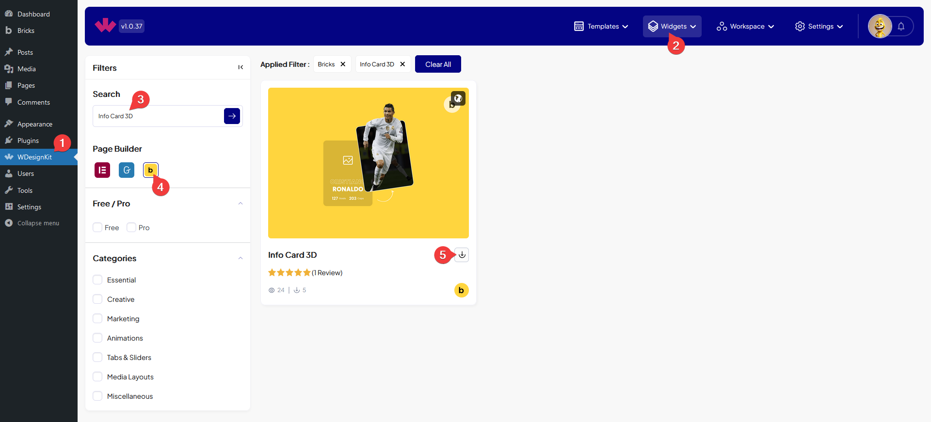
Go to
- WDesignKit → Widgets.
- Search the element name and select Bricks as the Page Builder.
- Click on the Download icon.
How to Use the Info Card 3D Element in Bricks?
Add the Info Card 3D element to the page.
Content
In the Main Banner Image section, you have to add the main background image.
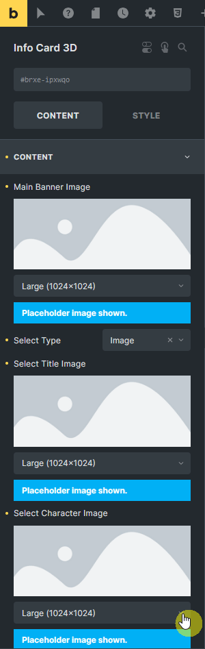
Then from the Select Type dropdown, you can select the content type that will be added above the main image. Here you’ll find two options –
- Text – With this option, you can add up to three different texts.
- Image – With this option, you can add an image.
Based on your selection, you’ll find different options to add content.
After that in the Select Character Image section, you have to add the image that you want to pop out on hover.
You can add different types of links to the entire box from the Box Link field.
Extra
When Text is selected as the content type from the Select Type dropdown, then you’ll find options to add strokes to all three texts separately.
From the Style tab, you can customize the style further.