
With this widget, you can add a smooth, water-like ripple effect behind any section of your website, creating a dynamic and calming background. It’s ideal for hero sections, landing pages, or creative portfolios that need a modern, soothing touch. You can fully customize the ripple’s speed, color, and intensity to match your site’s style and mood.
Required Setup
- Elementor FREE Plugin installed & activated.
- You need to have the WDesignKit plugin installed and activated.
- Make sure you’ve created an account and logged into it.
- Make sure you’ve downloaded the Ripple Background widget.
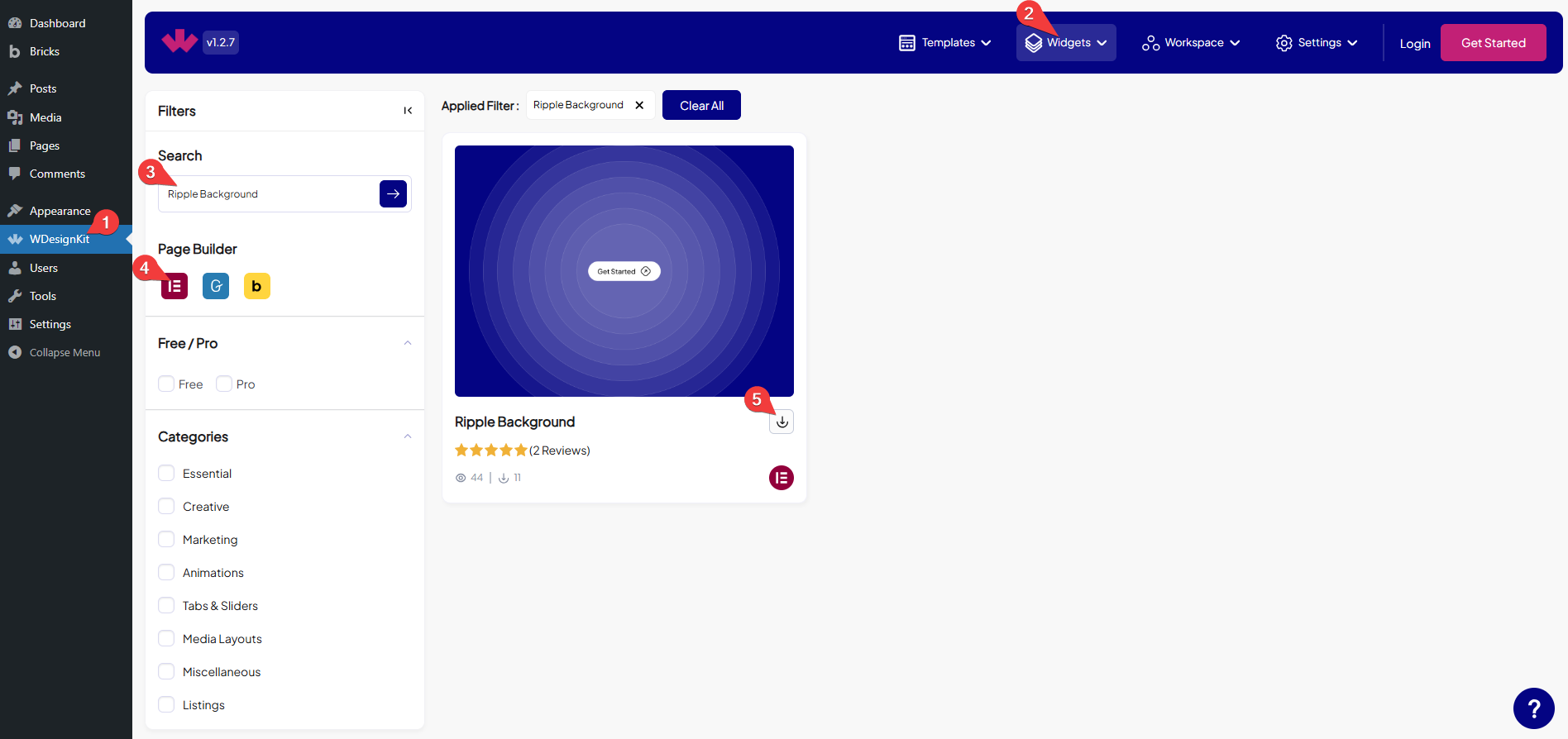
How to Activate the Ripple Background Widget?
Go to
- WDesignKit → Widgets.
- Search the widget name and select Elementor as the Page Builder.
- Click on the Download icon.
How to Use the Ripple Background Widget in Elementor?
Add the Ripple Background widget to the page.
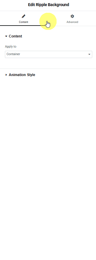
Content
From the Apply To dropdown, select the content type. The ripple background effect will be shown only in that selected area. Here you’ll find two options –
- Container – When you select Container from the Apply To dropdown, the ripple background effect will cover the entire container area.
- Section – When Section is selected, the ripple effect will be applied to the full section where the element is located.
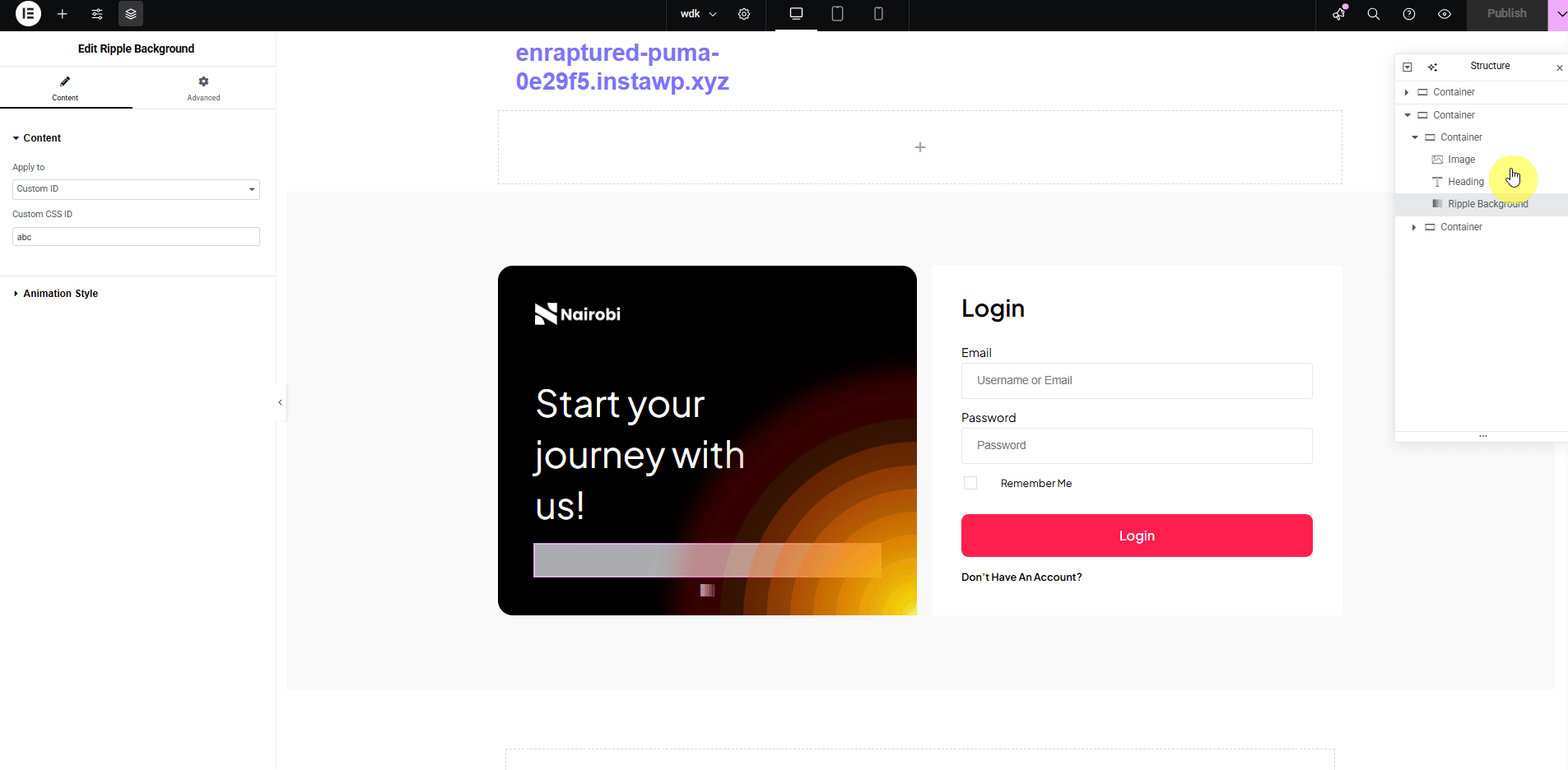
- Custom ID – If you choose Custom ID, the ripple background effect will be applied only to the specific element that matches the custom ID you provide.
Based on your selection, you’ll find different options to add the content.
In the Custom CSS ID field, you need to enter the ID of the element where you want to see the ripple effect.
Note: Selecting ‘Custom ID’ from the ‘Apply To’ dropdown will display the ‘Custom CSS ID’ field.
Note: If you are adding it for a particular container, then go to Container → Advanced → CSS ID, and the ID you enter there should also be added in the Custom CSS ID, for example: abc.
Animation Style
You can set the circle size for your content separately for desktop, tablet, and mobile devices using the Circle Size (Desktop), Circle Size (Tablet), and Circle Size (Mobile) sections, respectively.
You can set the circle’s quantity for your content separately for desktop, tablet, and mobile devices using the Circles Qty. (Desktop), Circles Qty. (Tablet), and Circles Qty. (Mobile) sections, respectively.
From the Opacity section, you can adjust the circle’s transparency.
From the Border Width section, you can set the thickness of the circle’s border.
From the Duration section, you can control how long the ripple effect lasts.
From the Color section, you can select the circle’s color to fit your design.
From the Shadow Spread section, you can adjust the size of the circle’s shadow.
By enabling the Gradient Color toggle, you can select two different colors (Color 1 and Color 2) to create a gradient background for the circle.
You can set the top position of the circle for your content separately for desktop, tablet, and mobile devices using the Top Offset (Desktop), Top Offset (Tablet), and Top Offset (Mobile) sections, respectively.
You can set the left position of the circle for your content separately for desktop, tablet, and mobile devices using the Left Offset (Desktop), Left Offset (Tablet), and Left Offset (Mobile) sections, respectively.
Note: You can set position for different screen size.