With this element, you can create a unique 3D scrolling effect where your cards rotate and move as you scroll, making your content more fun and engaging.
Required Setup
- Bricks Builder installed & activated.
- You need to have the WDesignKit plugin installed and activated.
- Make sure you’ve created an account and logged into it.
- Make sure you’ve downloaded the Scrolling 3D Cards element.
How to Activate the Scrolling 3D Cards Element?
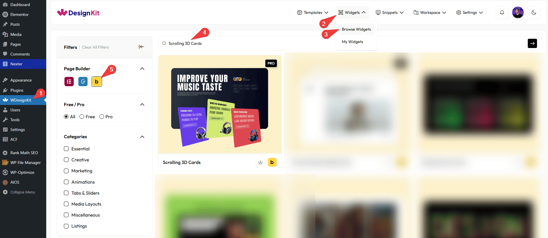
Go to
- WDesignKit → Widgets → Browse Widgets.
- Search the element name and select Bricks as the Page Builder.
- Click on the Download icon.
Use Cases
Use the Scrolling 3D Cards element when you want to create a visually impressive section where cards rotate and move with a 3D effect as users scroll. It adds depth, motion, and a modern interactive feel to your website.
Best For:
- Creative Portfolio Websites: Showcase your projects, artwork, case studies, or designs in a unique and engaging 3D scrolling layout.
- Agency & Studio Websites: Present services, campaigns, or featured work in a dynamic way that grabs attention instantly.
- Product Showcases: Highlight products with front-side visuals and detailed information on the back side of each card.
- Landing Pages: Create a strong visual impact by presenting key features or offers in an interactive scrolling section.
- Service Highlights: Display your services with images on the front and detailed points on the back using the flip-style card layout.
- Startup & Tech Websites: Show product features, app screens, or innovations with a modern 3D animation effect.
- Event & Campaign Pages: Promote events, launches, or special campaigns with eye-catching animated cards.
- Modern Business Websites: Add an advanced and premium look to your content sections to impress visitors.
- Interactive Storytelling Sections: Use the front and back card layout to reveal additional information as users scroll, making content more engaging.
How to Use the Scrolling 3D Cards Element in Bricks?
Add the Scrolling 3D Cards to the page.
CONTENT
Once you add the widget, by default, you’ll see three repeater items under the Cards section. Open one item.
In this repeater, you’ll see the menu items divided into two parts: Front and Back.
Let’s start with the Front section,
From the Select Image section, you have to choose an image here to see the scrolling 3d cards effect.
From the Title Heading Tags dropdown, you can set the title heading tag.
In the Title section, you can add a title to the image.
In the Subtitle section, you can add a subtitle to the image.
In the Button Text field, you can add a button text to the image.
Then, in the URL field, you can add the button URL.
By enabling the Open in new tab toggle, the attached URL will open in a new browser tab.
You can add an icon or SVG to the image from the Select Icon section.
CARDS
From this section, you can add the list items. By default, you’ll find three repeater items; open it.
In the Slide No. field, you can set the slide number so that when you scroll the page, you can easily identify which slide is currently active.
In the Title field, you can add the title of the slide.
From the Select Image section, you can choose an image of the slide.
In the Description field, you can add the description of the slide.
In the Button Text section, you can add the text to the button.
From the Select Icon section, you can choose either an icon or an SVG for the button.
Then, in the URL section, you can add a link to the button.
By enabling the Open in new tab toggle, the attached URL will open in a new browser tab.
After that, you can manage the Title Color, Subtitle Color, Button Text Color, Button Icon Color, Button SVG Color, Button Background Color, and Background Color for frontside.
Now, move on to the Back section.
From the Title Heading Tags dropdown, you can set the title heading tag.
In the Title section, you can add a title to the backside of the item.
From the Items section, you can add the content for the backside of the item.
Note: Use the pipe symbol ( | ) to separate multiple items. For example: item 1 | item 2 | item 3.
After that, you can manage the Title Color, Item Color, and Background Color for the backside.
Then, you can click the + ADD ITEM button to add more image cards.
EXTRA OPTIONS
By enabling the Dot toggle, you can display animated dots while scrolling, adding a dynamic visual effect to the Scrolling 3D Cards.
Note : After changing content or settings, animations may not update correctly in the editor preview. Please save and reload the editor or check the frontend for accurate results.
Make sure to disable the Backend Animation toggle when using multiple widgets to avoid conflicts and keep everything running smoothly.
Then, from the Style tab, you can further customize the style of the Scrolling 3D Cards.