With this element, you can create a smooth, scrollable column layout that highlights multiple items in an organized and visually appealing way. Each column allows you to add a Title, Select Images, and a Main Title, while controlling the Duration of the scroll animation.
The Column Scroll element is easy to customize and helps you present content dynamically, making your page more engaging and interactive across desktop, tablet, and mobile devices.
Required Setup
- Bricks Builder installed & activated.
- You need to have the WDesignKit plugin installed and activated.
- Make sure you’ve created an account and logged into it.
- This is a pro element, so make sure you have the WDesignKit Pro license activated in your WDesignKit account.
- Make sure you’ve downloaded the Column Scroll element.
How to Activate the Column Scroll Element?
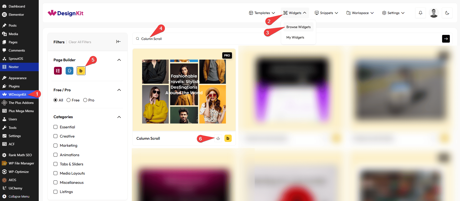
Go to
- WDesignKit → Widgets → Browse Widgets.
- Search the element name and select Bricks as the Page Builder.
- Click on the Download icon.
Use Cases
Use this Column Scroll element when you want to display multiple items in a smooth, scrollable column layout that looks organized and modern.
Best For:
- Showcasing Products or Services: Highlight multiple items like products, features, or services in an attractive, scrollable column layout.
- Portfolios & Projects: Display images with titles and main headings to showcase your work in a neat, interactive way.
- Landing Pages: Present key content or highlights dynamically without cluttering the page.
- E-commerce Websites: Feature product categories, promotions, or collections with smooth scrolling for better user experience.
- Blogs & News Sections: Display multiple posts or highlights with images, titles, and short descriptions in an engaging layout.
- Responsive Layouts: Perfect for desktop, tablet, and mobile screens, with adjustable column settings for each device.
- Interactive Content: Add multiple images, titles, and main headings with customizable scroll duration to create an engaging visual effect.
- Modern Website Designs: Keep your page organized and visually appealing while showing multiple items in a dynamic, animated way.
How to Use the Column Scroll in Bricks?
Add the Column Scroll element to the page.
CONTENT
Once you add the element, you’ll see a repeater item, from the Column section, you can add the text and image items. By default, you’ll find three repeater items, open it.
In the Title field, you can add the text for each column item.
Note: Use a comma (,) to separate titles for multiple items. Example: Title 1, Title 2, Title 3.
In the Select Images section, you can add images for the column slider. You can also add multiple images to better experience this widget’s effect.
In the Image Size section, you can choose the image size for the gallery images from the available image sizes.
You can click on the + ADD ITEM button to add more items.
MAIN TITLE
In the Text field, you can add a main heading for the column scroll section.
In the Background Invert option, you can enable or disable inverted background colors for the section.
Note: Enabling the Background Invert option will invert the effect for the text, image and background.
SPECIAL OPTIONS
From the Desktop Column field, you can set the number of columns displayed on desktop devices.
From the Tablet Column field, you can set the number of columns displayed on tablet devices.
From the Mobile Column field, you can set the number of columns displayed on mobile devices.
EXTRA OPTIONS
From the Duration (seconds) field, you can set how long each column scroll item stays visible.
Note: You can refresh the page after changing the duration to apply the new settings.
Then from the Style tab, you can further customize the style of the Column Scroll.