With this element, you can easily create attractive image stacks that add a sense of depth to your website. It allows you to show multiple images in a layered layout with smooth hover effects like spreading or lifting. The Image Stack 2 element is simple to customize, so you can match it with your website design while making your images look modern, clean, and engaging for users.
Required Setup
- Bricks Builder installed & activated.
- You need to have the WDesignKit plugin installed and activated.
- Make sure you’ve created an account and logged into it.
- This is a pro element, so make sure you have the WDesignKit Pro license activated in your WDesignKit account.
- Make sure you’ve downloaded the Image Stack 2 element.
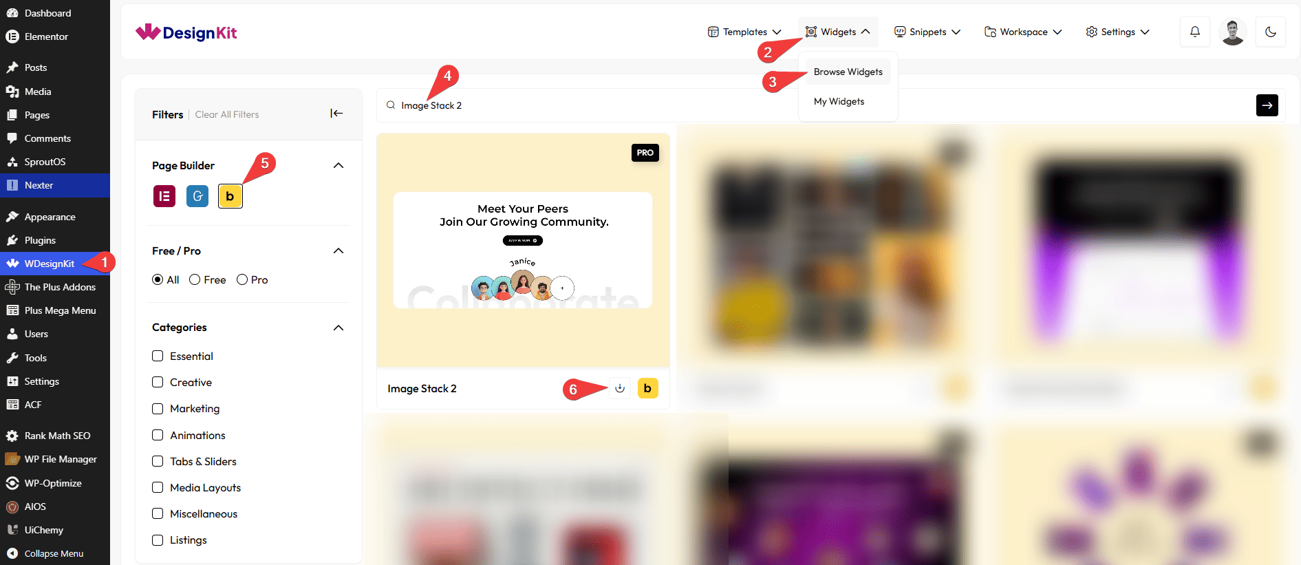
How to Activate the Image Stack 2 Element?
Go to
- WDesignKit → Widgets → Browse Widgets.
- Search the element name and select Bricks as the Page Builder.
- Click on the Download icon.
Use Cases
Use this Image Stack 2 element when you want to display images in a creative, layered style that looks modern and interactive without using heavy galleries or sliders.
Best For:
- Product Showcases:Display product images in a stacked layout to make them look premium and eye-catching.
- Photography Portfolios:Present photos in a stylish way that adds depth and visual interest.
- Creative Portfolios:Perfect for designers, artists, or creators who want to show their work in a unique layout.
- Mood Boards & Inspiration Sections:Arrange multiple images together to share ideas, concepts, or inspiration visually.
- Landing Pages:Highlight key visuals or featured images to grab user attention quickly.
- Brand Story Sections:Use layered images to visually tell your brand story or journey.
- Marketing Websites:Add interactive visuals that make campaigns and highlights stand out.
- Minimal Gallery Alternatives:Ideal when you want to show a few images creatively instead of using a full gallery.
- User Engagement Enhancement:Hover effects and tooltips encourage users to interact with images.
- Modern & Design-Focused Websites:Best suited for websites that want clean, stylish, and visually rich image presentations.
How to Use the Image Stack 2 in Bricks?
Add the Image Stack 2 element to the page.
LAYOUT
You can select a pre-defined style from the Style dropdown.
Note : From this tab, based on the style you selected, you will see different options to add the content.
CONTENT
From the Items section, you can add the image items. By default, you’ll find three repeater items, open it.
From the Select Image section, you can choose an image of the card.
In the Tooltip Text section, you can add the name that will be displayed when hovering over the image card.
From the URL field, you can add a link to the image.
By enabling the Open in new tab toggle, the attached URL will open in a new browser tab.
Under the Normal section from the Rotate(deg) field, you can set the rotation angle of the image card in its default state (before hover).
Under the Hover section from the Rotate(deg) field, you can set the rotation angle of the image card when the user hovers over it.
You can click on the + ADD ITEM button to add more items.
SPECIAL OPTIONS
From the Direction section, you can choose the direction in which the tooltip animation moves (for example, left to right and right to left).
From the Movement section, you can adjust how much the tooltip moves during the animation for each responsive device.
From the Transition (seconds) section, you can set the animation duration in seconds for each responsive device.
From the Tooltip Type section, you can select the visual style of the tooltip (such as Normal or Ring) for each responsive device.
From the Offset section, you can control the spacing between the tooltip and the image card for each responsive device.
EXTRA OPTIONS
Then, from the Alignment section, you can align the layout for responsive devices.
By enabling the Tablet Link toggle, you can activate the link for tablet devices.
By enabling the Mobile Link toggle, you can activate the link for mobile devices.
Then from the Style tab, you can further customize the style of the Image Stack 2.