With the Image Accordion element, you can display multiple images in an interactive accordion-style layout where images expand smoothly when clicked. This effect helps you showcase visuals in a clean, space-saving, and engaging way while highlighting one image at a time.
Required Setup
- Bricks Builder installed & activated.
- You need to have the WDesignKit plugin installed and activated.
- Make sure you’ve created an account and logged into it.
- Make sure you’ve downloaded the Interactive Links element.
How to Activate the Image Accordion Element?
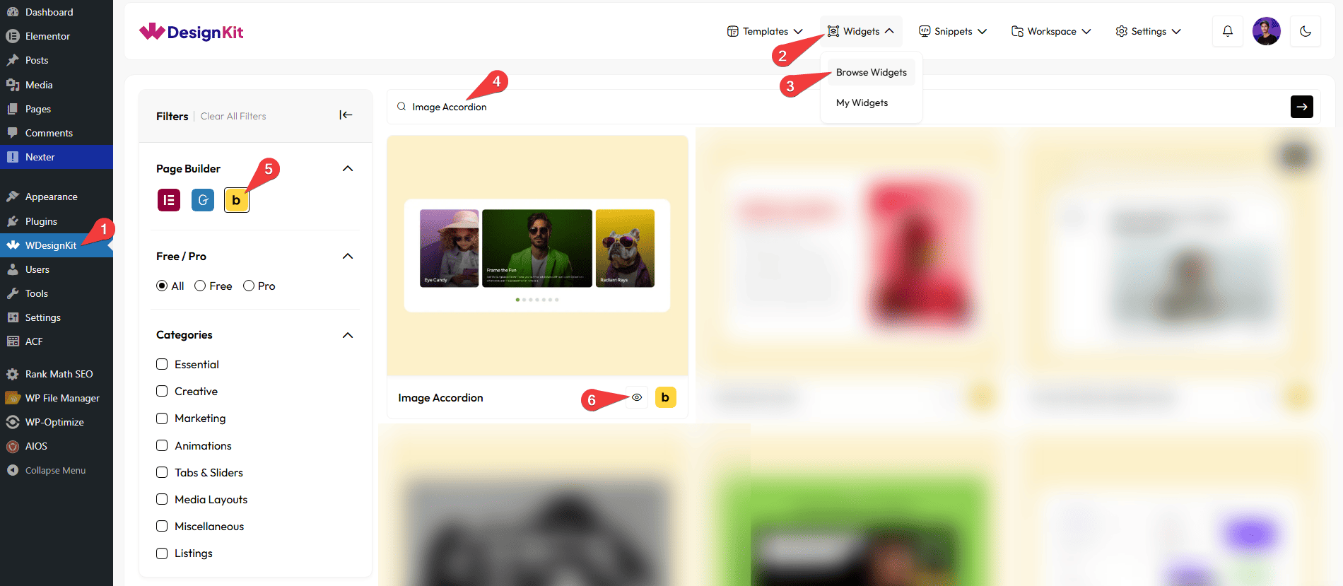
Go to
- WDesignKit → Widgets → Browse Widgets.
- Search the element name and select Bricks as the Page Builder.
- Click on the Download icon.
Use Cases
Use the Image Accordion element when you want to display multiple images in a compact, interactive layout where each image expands smoothly when clicked. It helps you present detailed visual content without taking up too much space, while keeping the design modern and engaging.
Best For:
- Creative Portfolio Websites: Showcase projects, case studies, or artwork in an expandable format where each image reveals more details when clicked.
- Photography Websites: Display photo collections, albums, or themed galleries in a clean, space-saving accordion layout.
- Agency & Studio Websites: Present services or campaign highlights with images and descriptions that expand for more information.
- Product Showcases: Highlight product features or variations, allowing users to click and explore each product visually.
- Real Estate Listings: Display property images with titles and descriptions in an organized and interactive way.
- Travel & Tourism Websites: Show destinations, packages, or experiences with expandable image sections for better storytelling.
- Landing Pages: Feature key offers, benefits, or sections in a visually attractive accordion layout to guide user attention.
- Event & Conference Websites: Present event highlights, speakers, or schedules with images that expand for additional details.
- Corporate & Business Websites: Display departments, company milestones, or solutions in a structured and professional accordion format.
- Modern UI Designs: Perfect for websites aiming for a sleek, minimal, and interactive experience while maintaining a clean layout.
How to Use the Image Accordion Element in Bricks?
Add the Image Accordion to the page.
CONTENT
From the Slides section, you have to add the image accordion items. By default, you’ll find one repeater item; open it.
In the Title field, you can add a title to the image accordion item.
Then, in the Description field, you can add a description.
You have to add the accordion item image from the Select Image section.
Then you can adjust the image accordion item title and description color for normal hover states.
From the Bottom Background section, you can add a background and border to the title and description section of the image accordion item.
You can adjust the bottom position of the image from the Bottom Offset section.
You can click on the + ADD ITEM button to add more items to the image accordion.
EXTRA OPTIONS
By enabling the Navigation Dots toggle, you can add the dot navigation to the slider.
Then, from the Style tab, you can further customize the style of the Image Accordion.