With this element, you can easily add two call-to-action buttons side by side on your website. You can customize each button with its own text, link, icon, and tooltip, giving users clear action choices. The Dual Buttons widget is easy to use and helps you create a clean, interactive, and engaging button layout.
Required Setup
- Bricks Builder installed & activated.
- You need to have the WDesignKit plugin installed and activated.
- Make sure you’ve created an account and logged into it.
- Make sure you’ve downloaded the Dual Buttons element.
How to Activate the Dual Buttons Element?
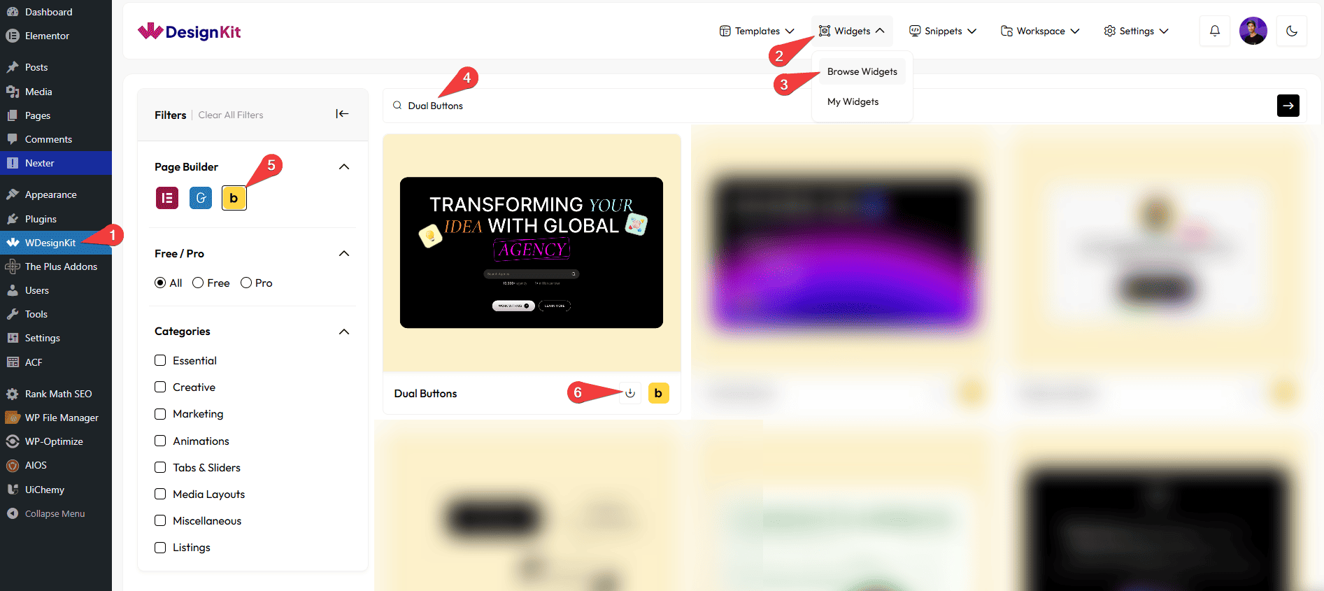
Go to
- WDesignKit → Widgets → Browse Widgets.
- Search the element name and select Bricks as the Page Builder.
- Click on the Download icon.
Use Cases
Use these Dual Buttons when you want to display two call-to-action buttons together in a clean, interactive, and user-friendly way.
Best For:
- Primary & Secondary Actions: Add two related actions side by side, such as one main action and one alternative option, to guide users clearly.
- Landing Pages: Place dual buttons on landing pages to increase conversions by offering users multiple action choices.
- Product & Service Pages: Use dual buttons for actions like viewing details, purchasing, downloading, or contacting support.
- Marketing Sections: Highlight promotions, offers, or campaigns with two call-to-action buttons for better engagement.
- Hero Sections: Add attention-grabbing buttons in hero areas to direct users to key pages or actions.
- Call-to-Action Blocks: Create strong call-to-action sections with two buttons for better user interaction.
- Responsive Websites: Ensure both buttons work smoothly across desktop, tablet, and mobile devices.
- User Engagement: Encourage users to take action by giving them clear and visible button choices.
- Clean & Professional Layouts: Ideal for websites that want a modern, organized, and visually consistent button design.
How to Use the Dual Buttons in Bricks?
Add the Dual Buttons element to the page.
PRIMARY BUTTON
In the Button Text field, you can add the text that will appear on the button.
From the URL field, you can add a link that opens when the button is clicked.
By enabling the Open in new tab toggle, the attached URL will open in a new browser tab.
From the Select Icon option under the Button Icon section, you can choose an icon or an SVG icon to display on the button.
From the Select Position option under the Button Icon section, you can set the position of the icon (Before or After the text).
By enabling the Tooltip toggle under the Tooltip section, you will be able to see its settings.
In the Text field under the Tooltip section, you can add the tooltip text that appears on hover.
From the Select Position option under the Tooltip section, you can choose where the tooltip appears (Top or Bottom).
SECONDARY BUTTON
The Secondary Button has the same options as the Primary Button.
EXTRA OPTIONS
From the Alignment section, you can align the button for responsive devices.
From the Badge Visibility toggle, you can show or hide the badge on the button.
By enabling the Tablet Link toggle, you can activate the link for tablet devices.
By enabling the Mobile Link toggle, you can activate the link for mobile devices.
Then, from the Style tab, you can further customize the style of the Dual Buttons.