With this element, you can add a smooth, water-like ripple effect behind any section of your website, creating a dynamic and calming background. It’s ideal for hero sections, landing pages, or creative portfolios that need a modern, soothing touch. You can fully customize the ripple’s speed, color, and intensity to match your site’s style and mood.
Required Setup
- Bricks Builder installed & activated.
- You need to have the WDesignKit plugin installed and activated.
- Make sure you’ve created an account and logged into it.
- Make sure you’ve downloaded the Ripple Background element.
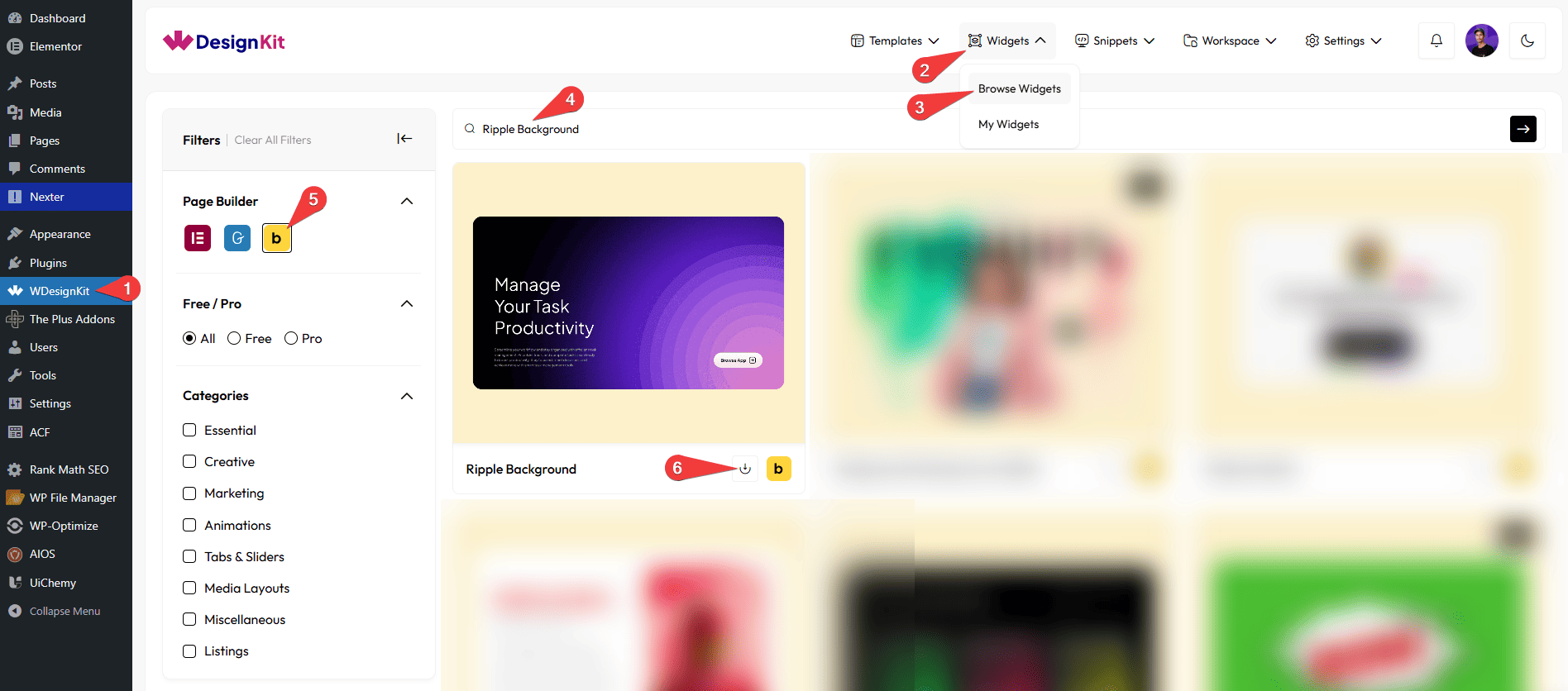
How to Activate the Ripple Background Element?
Go to
- WDesignKit → Widgets → Browse Widgets.
- Search the element name and select Bricks as the Page Builder.
- Click on the Download icon.
Use Cases
Use the Ripple Background element to create a smooth, water-like animation behind your content, making your website feel more dynamic and visually appealing. The subtle ripple effect adds a calming and modern touch, helping you enhance user experience without overwhelming the design.
Best For:
- Hero Sections: Create an eye-catching first impression with a smooth animated background.
- Landing Pages: Add a modern and engaging feel to improve user attention and conversions.
- Creative Portfolios: Showcase your work with a stylish and interactive background effect.
- Business Websites: Enhance visual appeal while maintaining a clean and professional look.
- Agency Websites: Add subtle motion to make sections more lively and engaging.
- Product Showcases: Highlight key sections with a soft animated background to draw focus.
- Modern UI Design: Perfect for minimal, clean, and animation-focused website layouts.
- Interactive Sections: Improve user engagement with smooth, non-distracting motion effects.
How to Use the Ripple Background in Bricks?
Add the Ripple Background element to the page.
LAYOUT
From the Apply effect to dropdown, select the content type. The ripple background effect will be shown only in that selected area. Here you’ll find two options –
- Container – When you select Container from the Apply To dropdown, the ripple background effect will cover the entire container area.
- Section – When Section is selected, the ripple effect will be applied to the full section where the element is located.
- Custom ID – If you choose Custom ID, the ripple background effect will be applied only to the specific element that matches the custom ID you provide.
Based on your selection, you’ll find different options to add the content.
In the Custom CSS ID field, you need to enter the ID of the element where you want to see the ripple effect.
Note: Selecting ‘Custom ID’ from the ‘Apply effect to’ dropdown will display the ‘Custom CSS ID’ field.
Note : If you are adding it for a particular container, then go to Container → Advanced → CSS ID, and the ID you enter there should also be added in the Custom CSS ID, for example: abc.
Note: Enter custom css ID without #, . etc. symbol.
CIRCLE SIZE
You can set the circle size for your content separately for desktop, tablet, and mobile devices using the Size (Desktop), Size (Tablet), and Size (Mobile) sections, respectively.
CIRCLE QUANTITY
You can set the circle’s quantity for your content separately for desktop, tablet, and mobile devices using the Quantity. (Desktop), Quantity. (Tablet), and Quantity. (Mobile) sections, respectively.
CIRCLE STYLE
From the Color section, you can select the circle’s color to fit your design.
By enabling the Gradient Color toggle, you can select two different colors (Color 1 and Color 2) to create a gradient background for the circle.
From the Border Width section, you can set the thickness of the circle’s border.
From the Border Color section, you can select the color of the circle’s border.
From the Shadow Spread section, you can adjust the size of the circle’s shadow.
From the Circles Gap section, you can adjust the space between the circles.
OFFSET
You can set the top position of the circle for your content separately for desktop, tablet, and mobile devices using the Top Offset (Desktop), Top Offset (Tablet), and Top Offset (Mobile) sections, respectively.
You can set the left position of the circle for your content separately for desktop, tablet, and mobile devices using the Left Offset (Desktop), Left Offset (Tablet), and Left Offset (Mobile) sections, respectively.
Note: You can set position for different screen size.
CIRCLE ANIMATION
From the Opacity section, you can adjust the circle’s transparency.
From the Duration section, you can control how long the ripple effect lasts.
Then, from the Style tab, you can further customize the style of the Ripple Background.