With this element, you can add a stylish and dynamic touch to your call-to-action buttons and text with smooth hover effects. It makes your content more interactive and engaging, encouraging users to take action. This effect enhances user experience by highlighting important elements, helping you create a modern and visually appealing interface.
Required Setup
- Bricks Builder installed & activated.
- You need to have the WDesignKit plugin installed and activated.
- Make sure you’ve created an account and logged into it.
- Make sure you’ve downloaded the Magic Hover CTA element.
How to Activate the Magic Hover CTA Element?
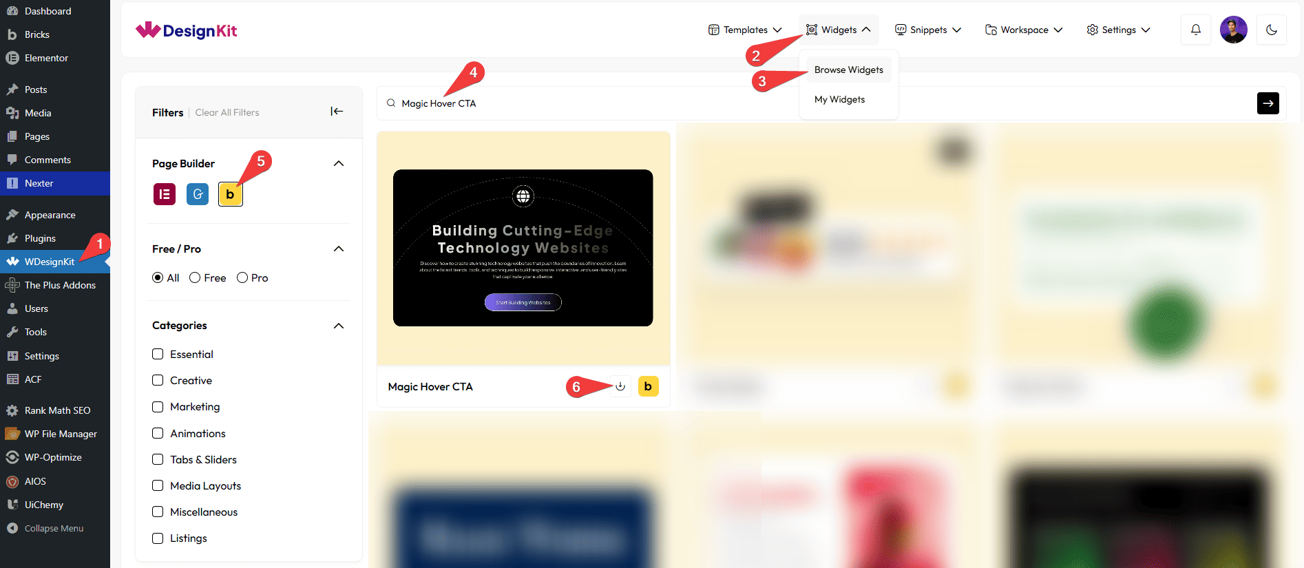
Go to
- WDesignKit → Widgets → Browse Widgets.
- Search the element name and select Bricks as the Page Builder.
- Click on the Download icon.
Use Cases
Use the Magic Hover CTA element when you want to highlight important content and call-to-action sections with interactive hover effects. It adds smooth animations, glow effects, and dynamic styling that attract user attention and encourage interaction. This element works seamlessly across all devices and is perfect for creating engaging and modern UI experiences.
Best For:
- Call-to-Action Sections: Highlight buttons like “Get Started”, “Learn More”, or “Contact Us” with engaging hover effects.
- Landing Pages: Improve conversions by making CTA sections more interactive and visually appealing.
- Marketing & Promotions: Draw attention to special offers, deals, or campaigns.
- Feature Highlights: Showcase key features or services with dynamic hover animations.
- Portfolio Websites: Present projects or services with stylish and interactive content blocks.
- Agency & Business Sites: Enhance sections with modern UI effects to impress users.
- Interactive Content Blocks: Make titles, descriptions, and icons more engaging on hover.
- E-commerce Websites: Highlight product categories or offers with eye-catching CTAs.
- App & Software Websites: Improve user engagement with modern hover interactions.
- Modern UI Design: Perfect for clean, interactive, and visually appealing website layouts.
How to Use the Magic Hover CTA Element in Bricks?
Add the Magic Hover CTA element to the page.
CONTENT
In the Title section, you can add the text for the content.
From the Description section, you can add the description for the content.
You can add an icon or SVG to the content from the Select Icon section.
CONTENT
In the Button Text section, you can add the text for the button.
Then, in the URL section, you can add a link to the text.
By enabling the Open in new tab toggle, the attached URL will open in a new browser tab.
EXTRA OPTIONS
From the Mouse Hover Color section, you can add a glow color effect to the item, which you will see when you hover over it.
From the Title Stroke Color section, you can change the title stroke color on hover.
From the Icon Stroke Color section, you can change the icon stroke color on hover.
From the Minimum Opacity field, you can set the lowest opacity level for the hover effect.
From the Maximum Opacity field, you can set the highest opacity level for the hover effect.
Note:Use the opacity options to control and manage the hover effect visibility.
Then, from the Style tab, you can further customize the style of the Magic Hover CTA.