With this element, you can show customer reviews in a rotating circular gallery. It is ideal for Marketing Pages, Product Pages, Landing Pages, Editorial layouts, Magazine-style layouts, Hero sections, and Portfolios.
Required Setup
- Bricks Builder installed & activated.
- You need to have the WDesignKit plugin installed and activated.
- Make sure you’ve created an account and logged into it.
- This is a pro element, so make sure you have the WDesignKit Pro license activated in your WDesignKit account.
- Make sure you’ve downloaded the Flashing Circular Rotating Gallery element.
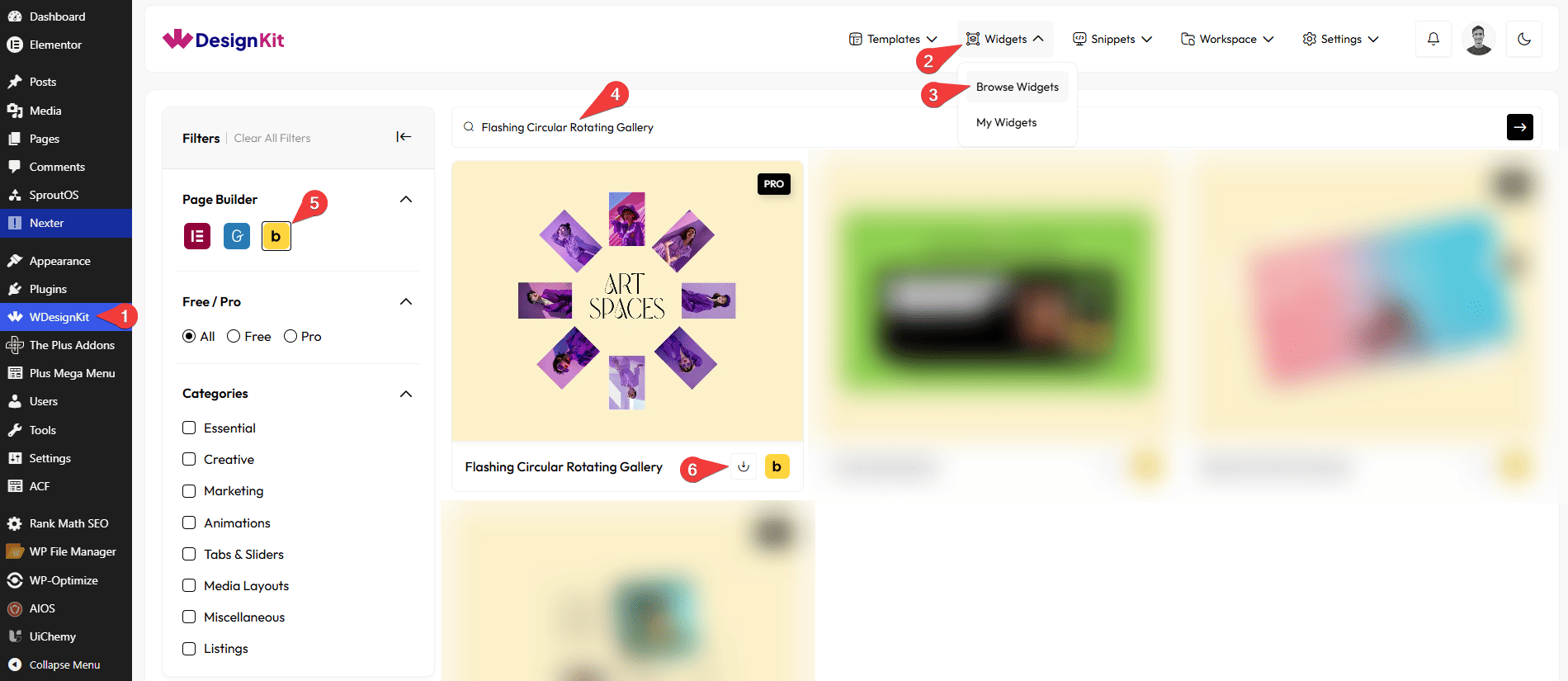
How to Activate the Flashing Circular Rotating Gallery Element?
Go to
- WDesignKit → Widgets → Browse Widgets.
- Search the element name and select Bricks as the Page Builder.
- Click on the Download icon.
Use Cases
Use this Flashing Circular Rotating Gallery when you want to display multiple images in a fun, modern circular layout.
Best For:
- Creative Photo Display: Artwork, photography, design shots.
- Product Showcase: Display product images or models.
- Brand Logos: Show partner, sponsor, or client logos.
- Team Members: Highlight team photos uniquely.
- Feature Highlights: Show visual icons or feature images.
- Event Photos: Share highlights or behind-the-scenes shots.
How to Use the Flashing Circular Rotating Gallery in Bricks?
Add the Flashing Circular Rotating Gallery element to the page.
LAYOUT
You can select a pre-defined style from the Style dropdown.
Note : From this tab, based on the style you selected, you will see different options to add the content.
CONTENT
In the Title field, you can add the title of the card.
From the Select Icon section, you can choose either an icon or an SVG to the card.
In the Subtitle field, you can add the subtitle of the card.
GALLERY
From the Images section, you can add the list items. By default, you’ll find six repeater items, open it.
From the Select Image section, you can choose an image of the card.
Then in the URL section, you can add a link to the card.
By enabling the Open in new tab toggle, the attached URL will open in a new browser tab.
EXTRA OPTIONS
From the Desktop Radius section, you can set the card width for desktop screens.
From the Tablet Radius section, you can set the card width for tablet screens.
From the Mobile Radius section, you can set the card width for mobile screens.
Note: Use different gallery radius values without PX(Unit) to keep the design balanced on all screen sizes.
From the Images Gap section, you can set the space between images.
Note: Use the Images Gap option without PX(Unit) to apply breathing space between images.
Then, from the Style tab, you can further customize the style of the Flashing Circular Rotating Gallery.